Super on your storefront
Get your customers thinking about Super at the beginning of their shopping journey.
Positioning Super Payments
Using Super as a checkout method will ensure that shoppers will have a better shopping experience, increasing the likelihood that they’ll purchase from your store, increase their average order value and come back again.
Until shoppers reach your checkout, they’re not aware of the money off benefits that Super can provide. Letting them know early on in their shopping journey that Super is available as a checkout option through checkout messaging will help their purchase decision, knowing that they’ll get money off.
Storefront Banner
A banner can be added to your storefront landing page, and if required to every page throughout your storefront, to remind your customers of the value of using Super to pay.

Product Details Page
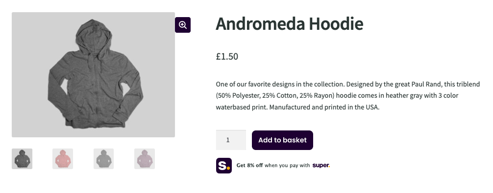
Adding Super below the "Add to Basket" Call To Action (CTA) reminds customer of the value of using Super to pay later on at your checkout.

Basket / Cart Page
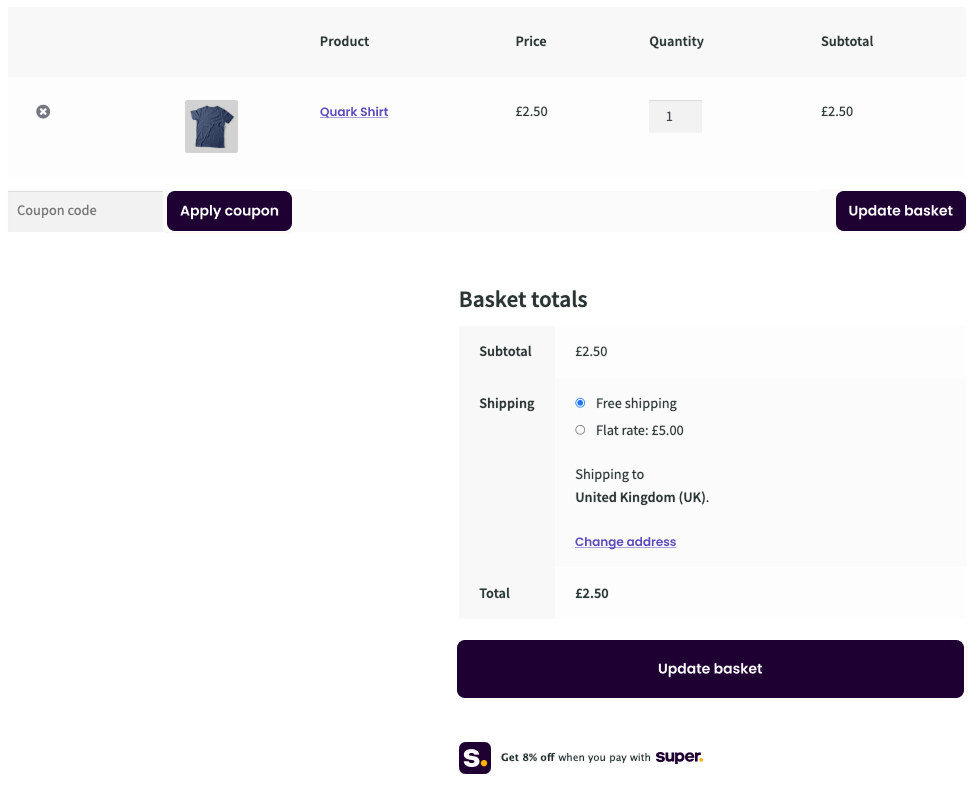
Adding Super below the "Proceed to Checkout" Call To Action (CTA) reminds customer of the value of using Super to pay later on at your checkout.

Checkout Page
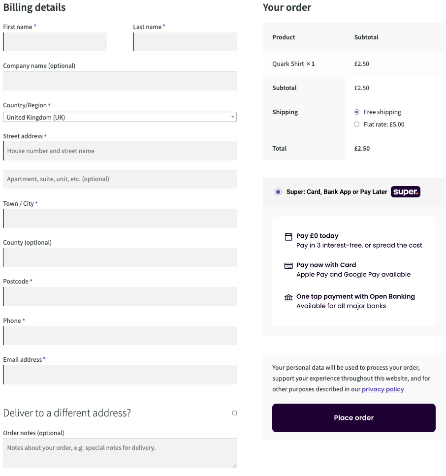
Placing Super at at the top of your payments options as the default payment option maximised the number of customers using Super to pay, saving you and your customers money.

Payment
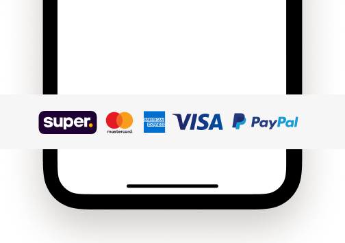
A subtle, yet impactful, part of Super checkout messaging is to feature Super’s logo alongside the other payment methods which most likely already exist within your website’s footer.
Sitting alongside other expected checkout methods such as Visa, Mastercard and Paypal will promote awareness of Super across your entire store.

Updated 7 months ago
